Role: Research, Design, Testing
Project timeframe: 3 months
Tools used: Draw.io, Figma
Fundspring is a website that provides an easy, guided approach to creating and sharing fundraising campaigns. It was completed as a capstone project for the Springboard UX Design course.
Discovery
Many small nonprofits are volunteer-driven and receive zero state or federal funding. Fundraising is their livelihood, but a small, unpaid workforce can hinder big fundraising goals.
User Research
I surveyed 15 people who worked for nonprofits. About 60% said their nonprofit relied on fundraising for its livelihood. Most of them worked for a nonprofit that had fewer than 25 employees and no dedicated marketing staff.
Roughly 10% of all participants had ever used a fundraising website.
Challenges
After five 1:1 phone interviews, I noticed the following trends:
- Senior staff intimidated by technology
- Lack of staff confidence to use such a tool
- Raised funds were not immediately available
Combining this information with the data from my previous surveys, the following personas emerged.


The Problem Space
Sites such as YouCaring.com and GoFundMe rely on a “blank canvas” approach that can be overwhelming to users who have never used such a service and/or aren’t sure how to write an effective fundraising story. They require a certain level of confidence and knowledge.
Plus, collecting funds at the end of a campaign can be challenging for new users.
Solution
Fundspring has a simple on-boarding process that’s easy to navigate. Once users join, the campaign builder asks for specific content that is helpful for crafting a concise, yet compelling story.

The user dashboard makes it easy to track campaign goals and data, share a campaign, and find tips for a successful campaign.
Users can also connect a bank account to have quick, easy access to the funds raised through a transfer process similar to PayPal.
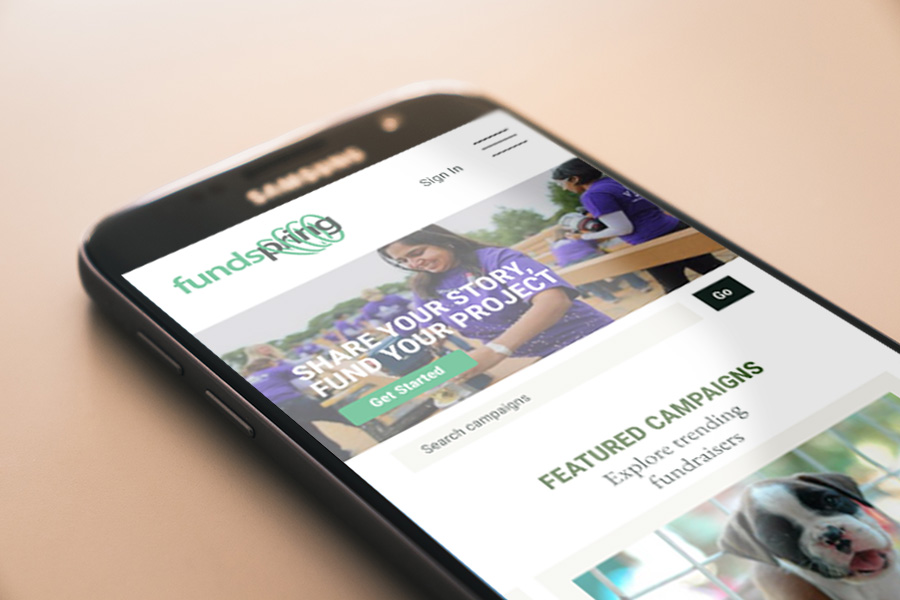
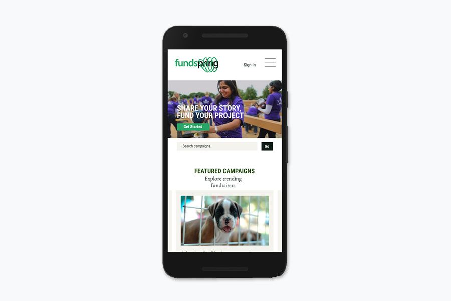
Designing the mobile site
I started sketching by hand. I found this method easiest to edit and incorporate new ideas without investing too much time with tech. Plus, who doesn’t love art supplies?

After sketching some of the most fundamental screens, I moved to the web-based tool Figma to create medium-fidelity wireframes.
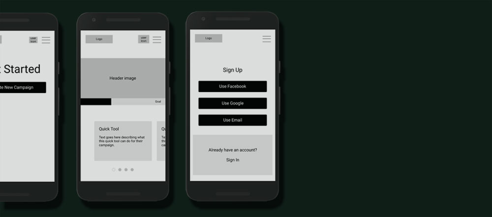
Continuing with Figma, I turned my wireframes into a clickable prototype that worked through most of the site’s main functions.
User Testing
The first iteration of the prototype didn’t clearly distinguish main menu options for logged in and logged out users. This was something I didn’t fully consider as I developed the information architecture. I devised an additional menu to reflect a user’s logged in state.
Also, there was no clear distinction between a user menu and a main menu. So I added a second menu for logged in users that pertains specifically to their account tools.
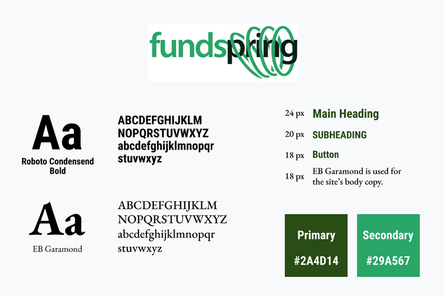
Branding